Property & Development Branding
Noosaville, QDL
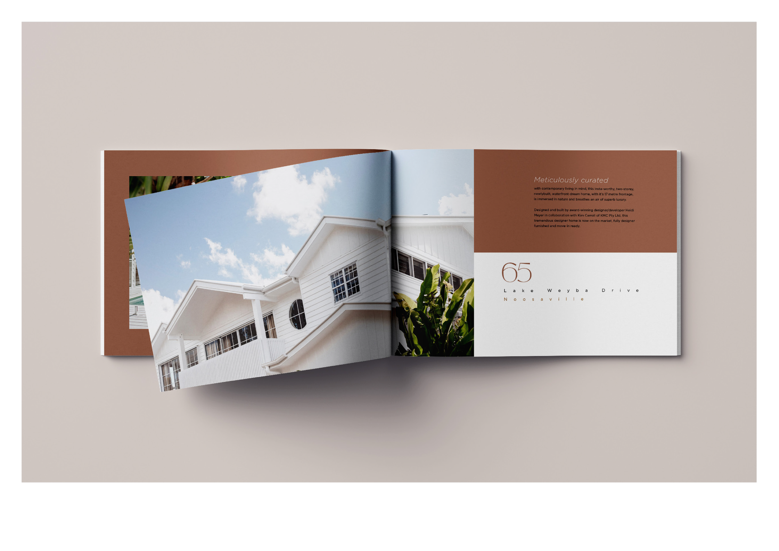
The Lake Haus, QDLThe Lake Haus is a newly built, fully furnished waterfront residence in Noosaville. Its visual identity was designed to capture the calm sophistication of coastal living, combining architectural elegance, natural textures and a warm, contemporary aesthetic. The result is a distinctive brand that positions the property as both a premium residence and a welcoming private oasis.
❋ Concept & StorytellingThe concept centres on the feeling of arriving at a private waterfront retreat—a place where thoughtful design, comfort and the Noosa lifestyle come naturally together.
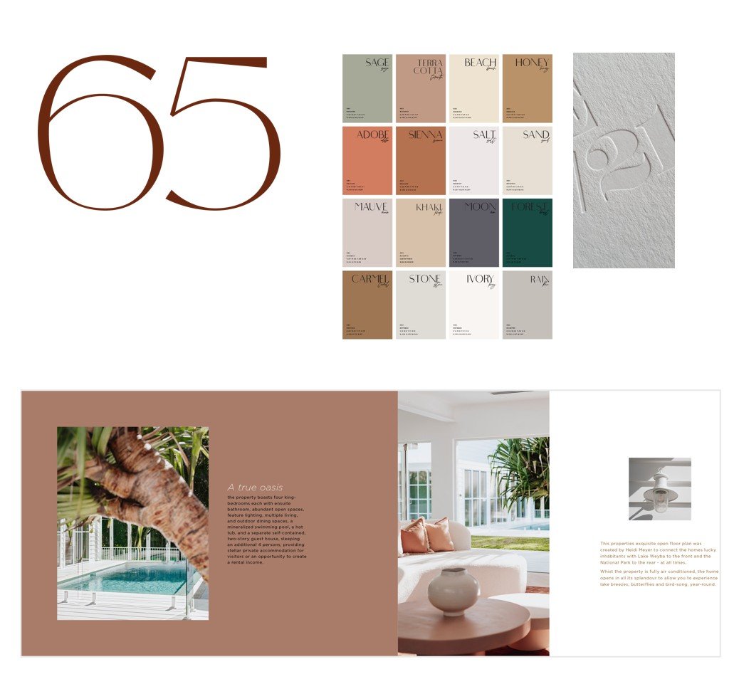
❋ Distinctive Visual IdentityThe number 65 became the central graphic element of the identity, creating a memorable visual signature connected directly to the property and its location.
❋ Typograph & ColourRefined typography is paired with a nature-inspired palette of coastal neutrals, earthy terracottas and deep greens, reflecting the architecture, landscape and relaxed atmosphere of Noosaville.
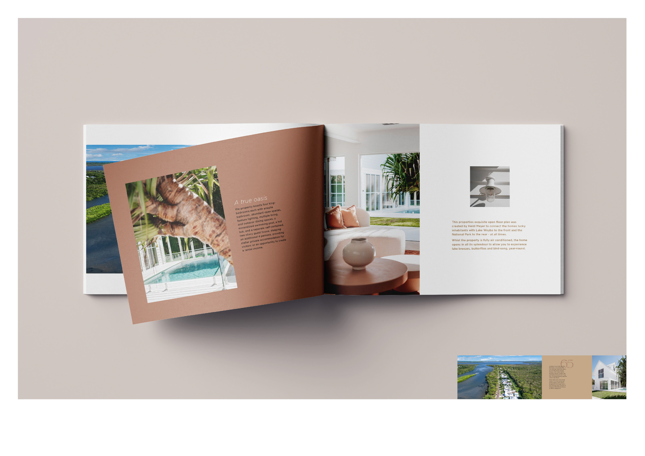
❋ Editorial ApplicationThe identity was extended across a carefully designed property brochure, combining architectural photography, generous layouts and tactile details to present The Lake Haus as a cohesive and desirable lifestyle experience.
Corimbia, WA
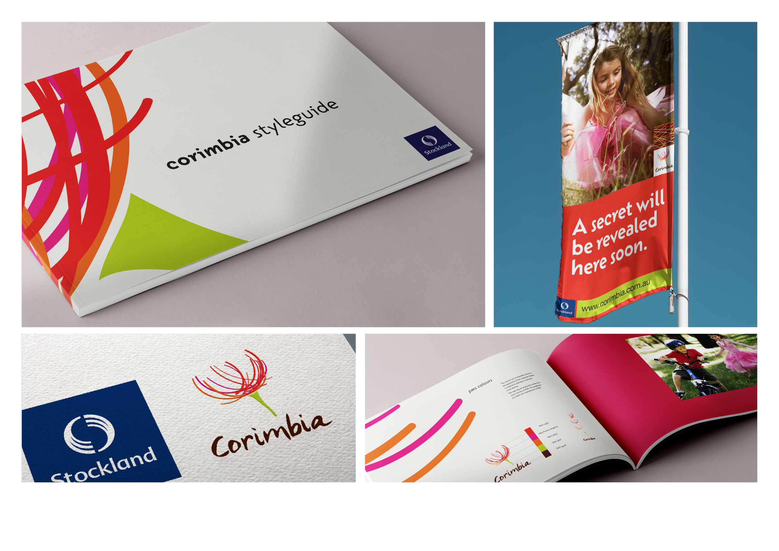
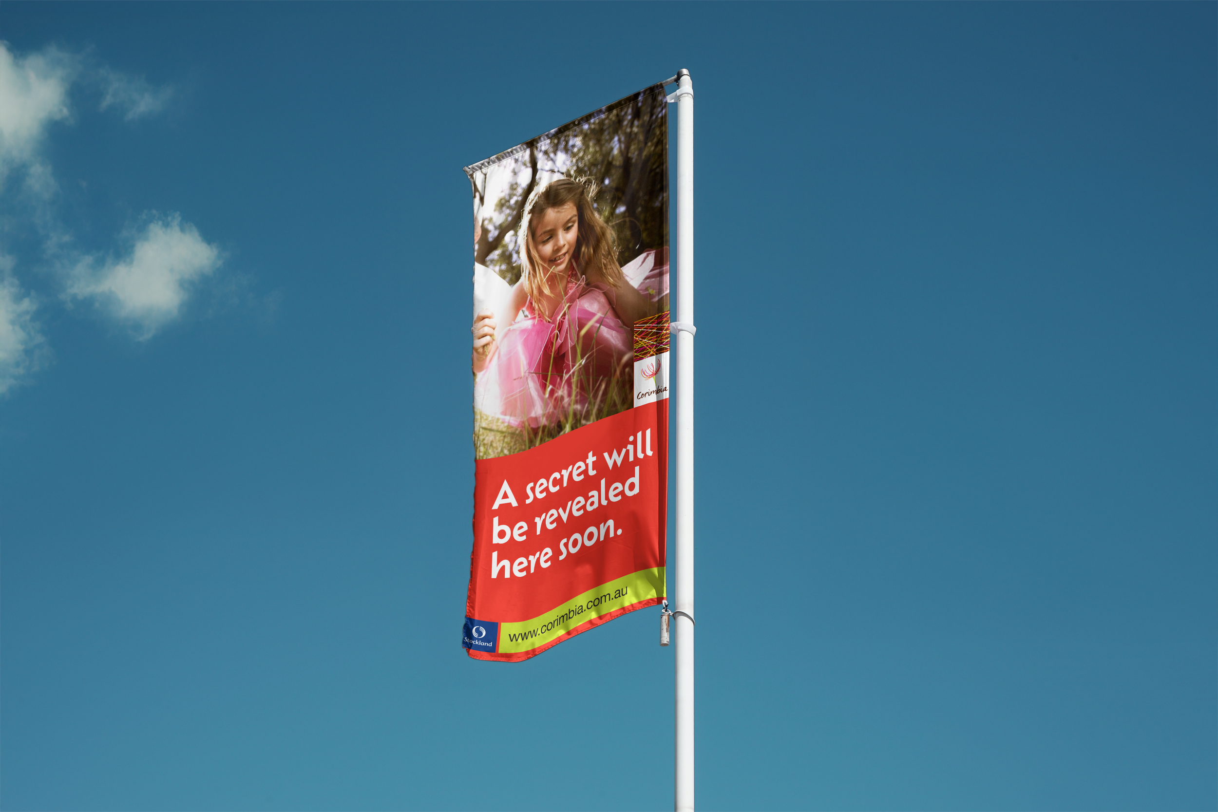
Corimbia, WACorimbia is a residential community created for Stockland in Western Australia. Inspired by the native landscape and the energy of outdoor living, the identity brings together colour, movement and a strong sense of belonging. The result is a warm and distinctive brand designed to connect with families and communicate the promise of a vibrant new community.
❋ Concept & StorytellingThe brand story was built around the idea of a community growing naturally—where homes, families and the surrounding landscape could flourish together.
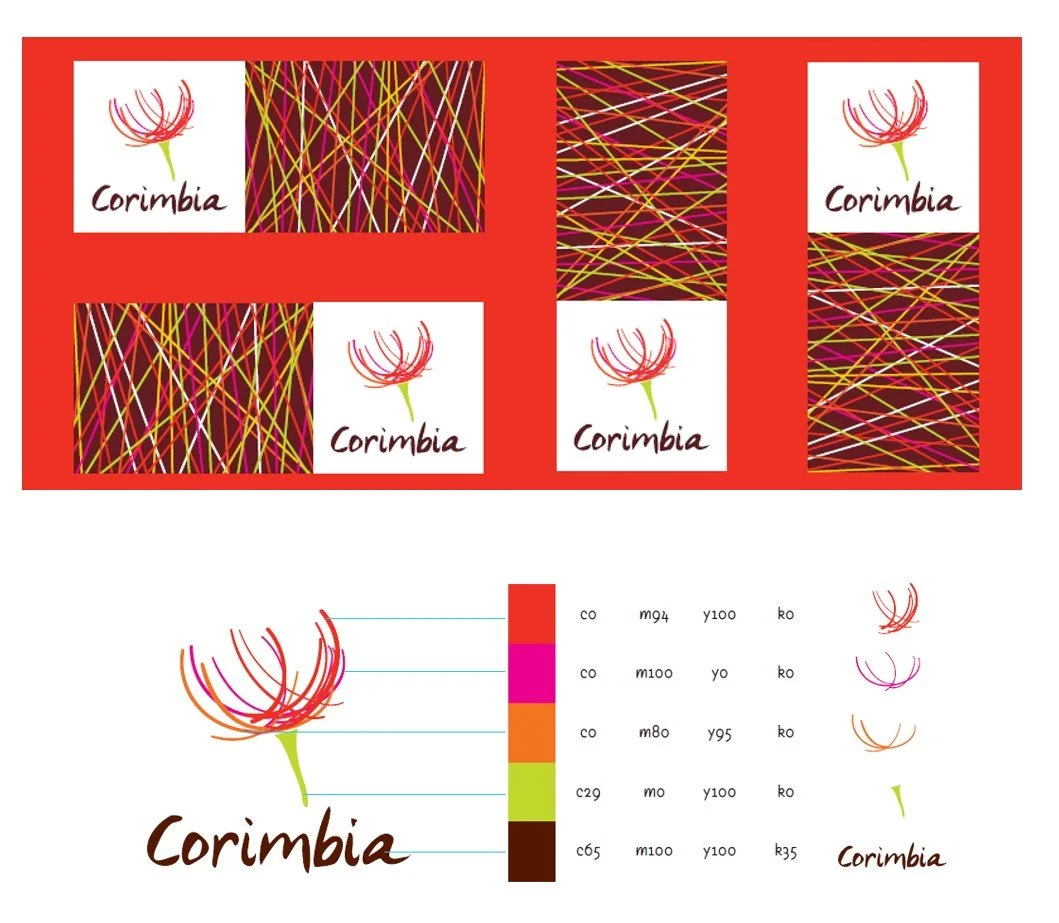
❋ Nature-LedThe Corimbia symbol draws inspiration from native flora, creating an expressive and memorable visual signature with a strong connection to place.
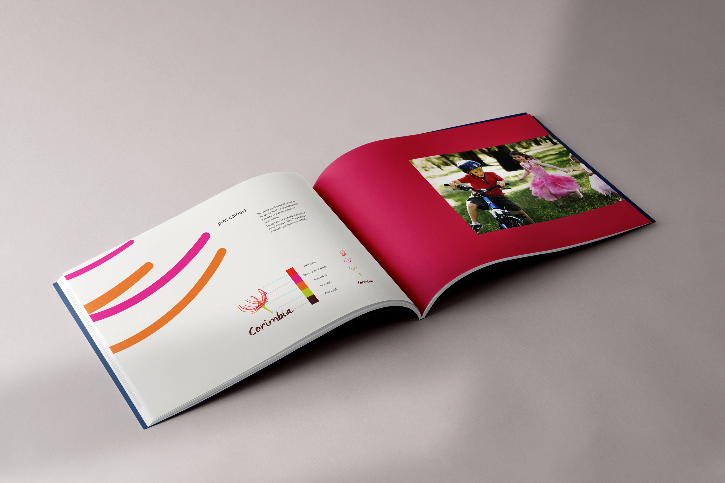
❋ Typograph & ColourA vibrant palette of red, orange, pink and green was combined with organic graphic elements to convey optimism, movement and the diversity of community life.
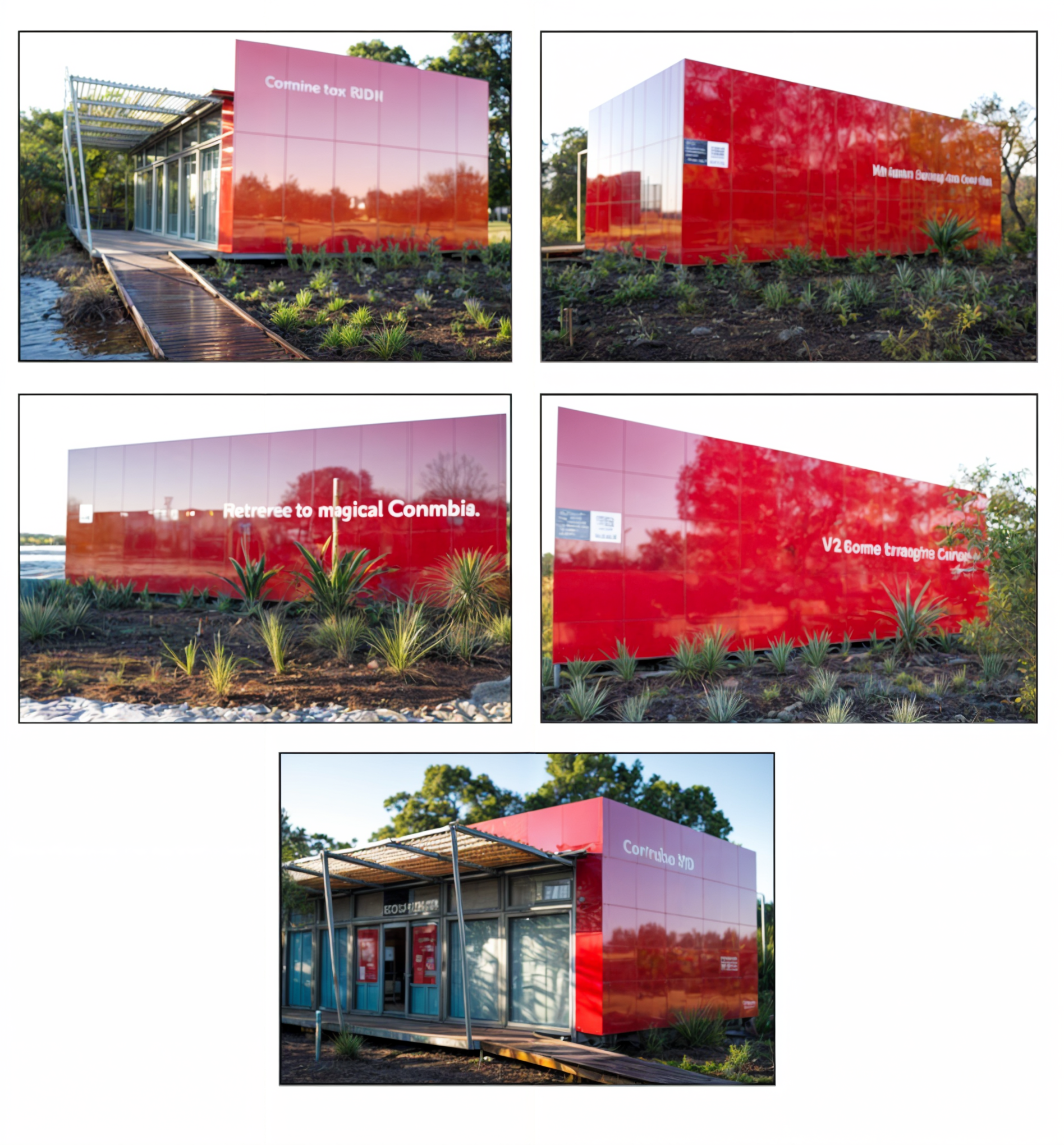
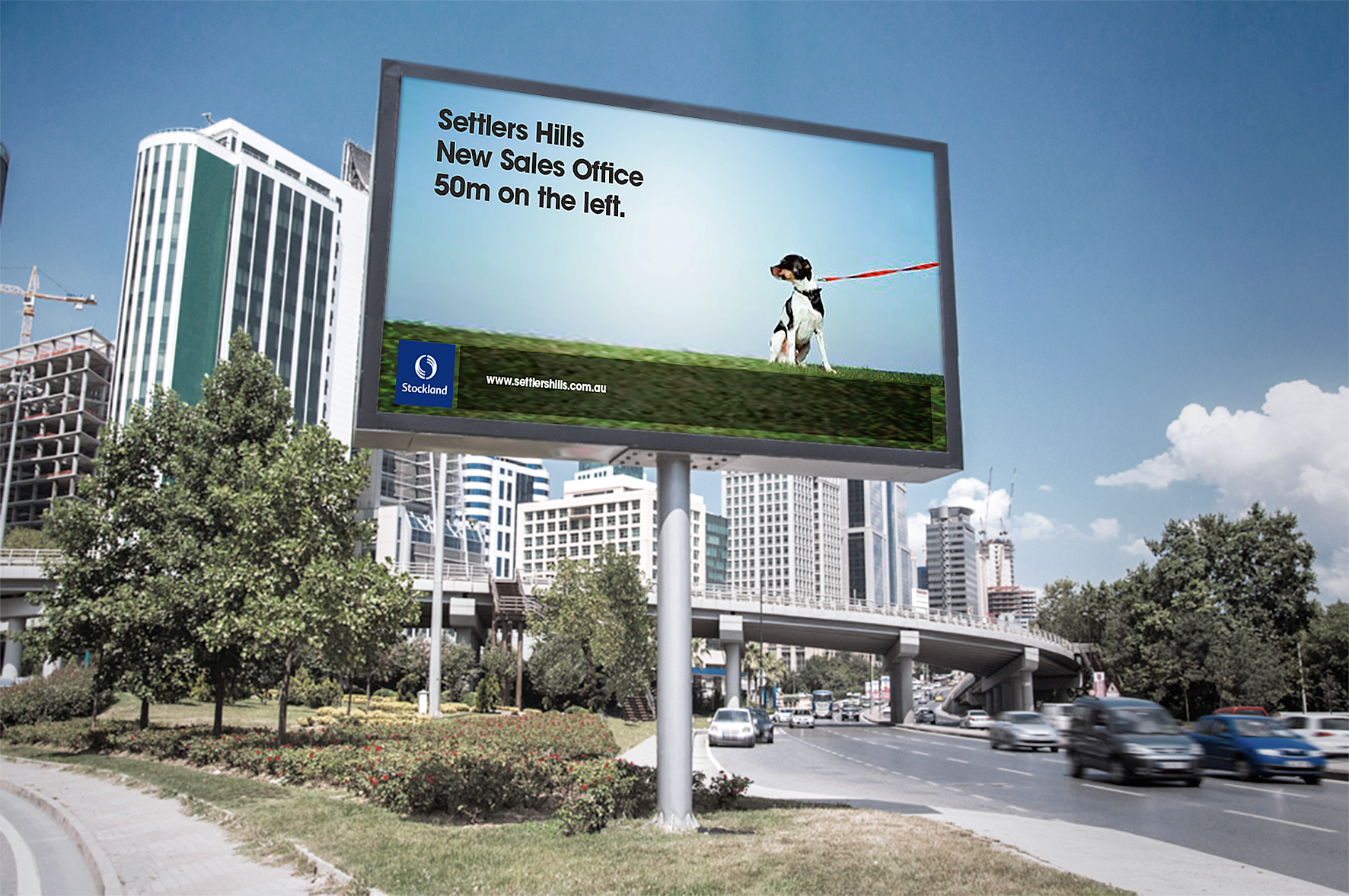
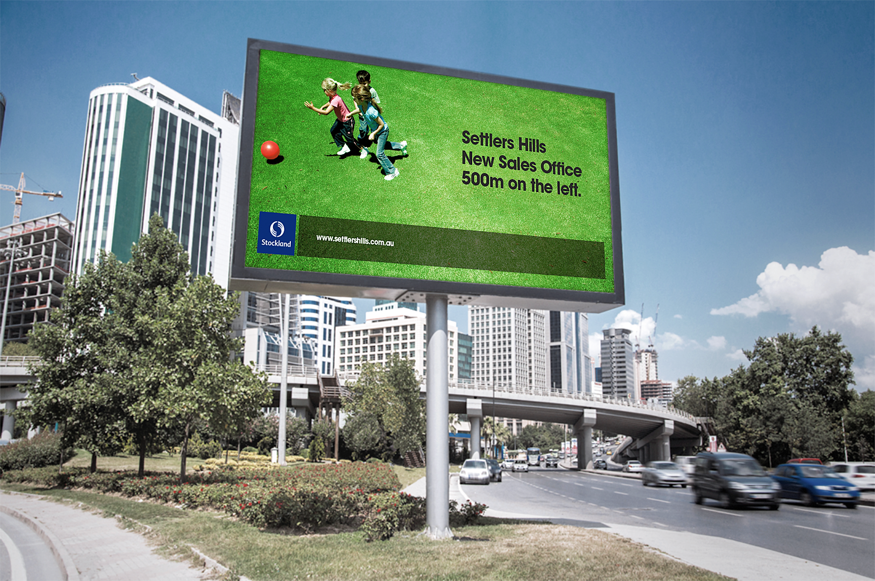
❋ Editorial ApplicationThe identity was developed across brand guidelines, printed collateral and outdoor launch materials, creating a consistent and highly visible presence throughout the development.
Vitta, Brasil
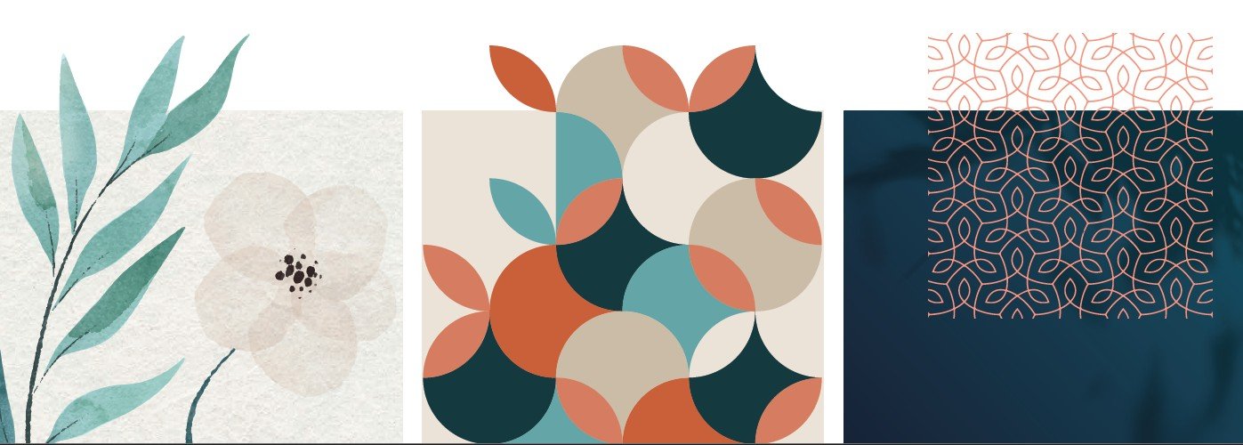
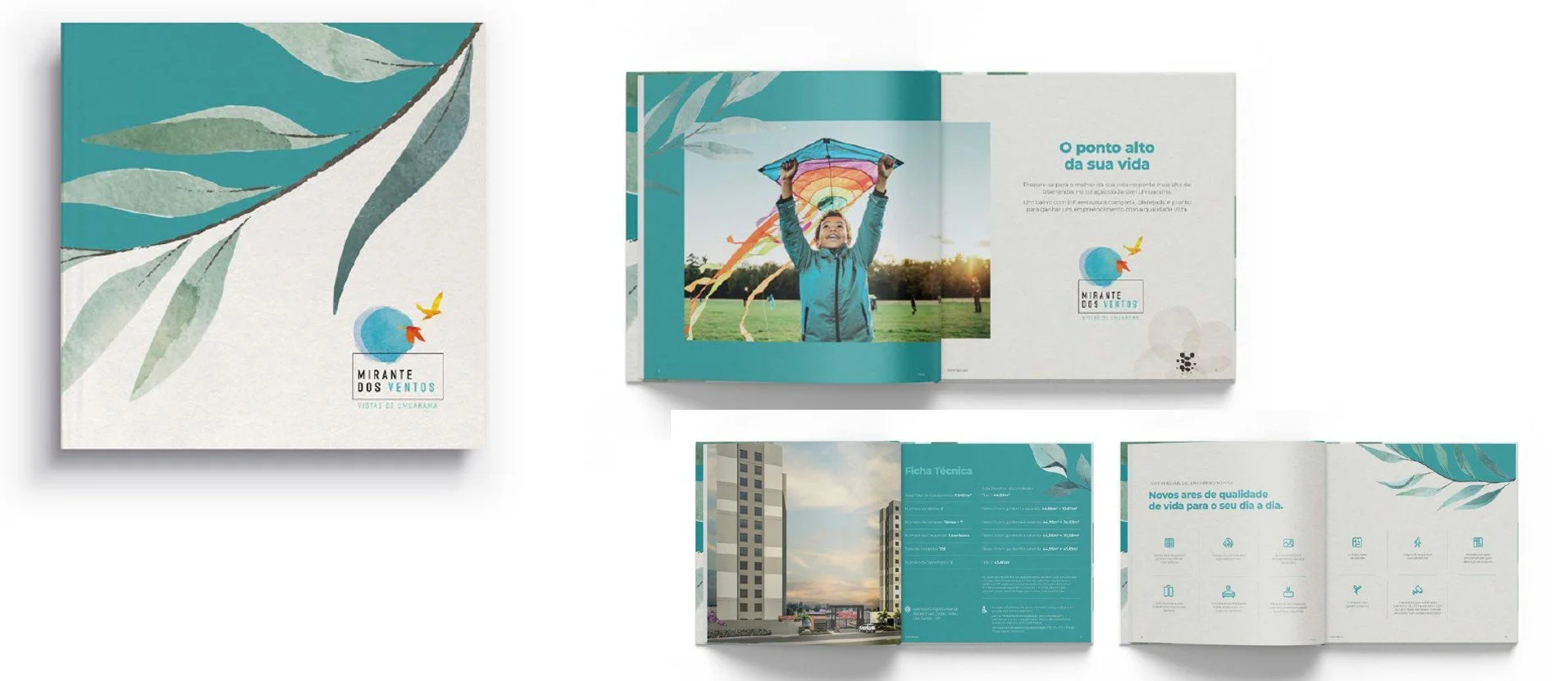
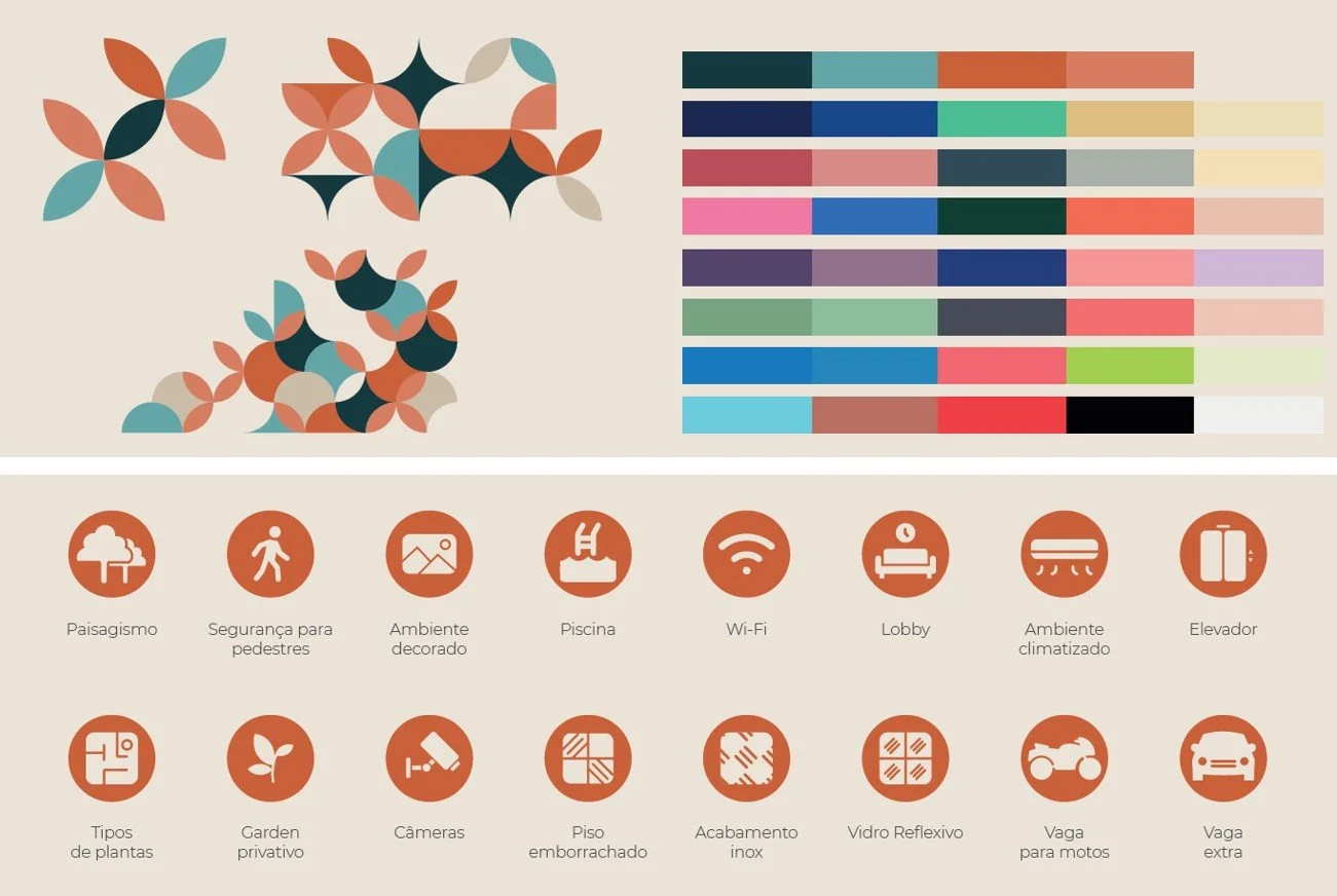
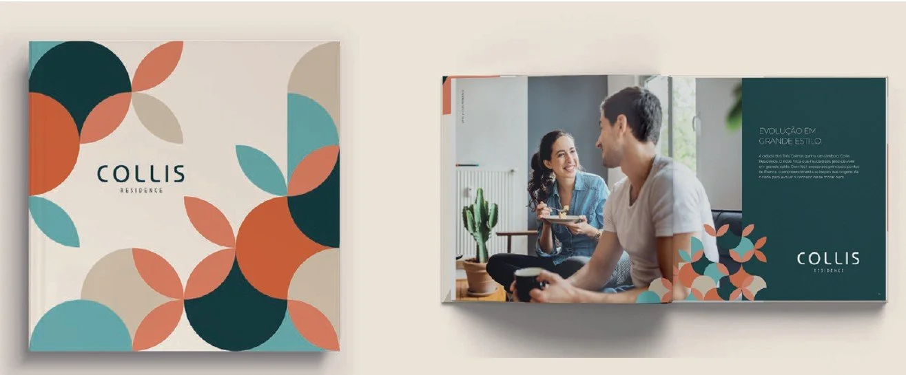
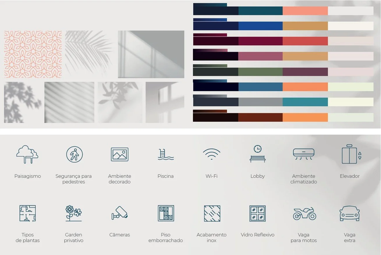
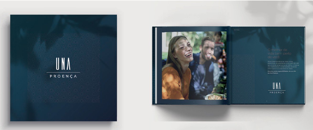
Vitta, BrasilVitta house development required a scalable visual identity system for residential developments delivered through a government housing programme across Brazil. Three distinct creative directions were developed, each aligned with a different building typology, floor plan and architectural style. A comprehensive visual assets guideline enabled new projects to be adapted for different cities while maintaining consistency, accelerating approvals and protecting the quality of the brand.
❋ Scalable Brand ArchitectureA flexible brand structure was created to support the expansion of multiple residential developments without having to build every identity from the beginning.
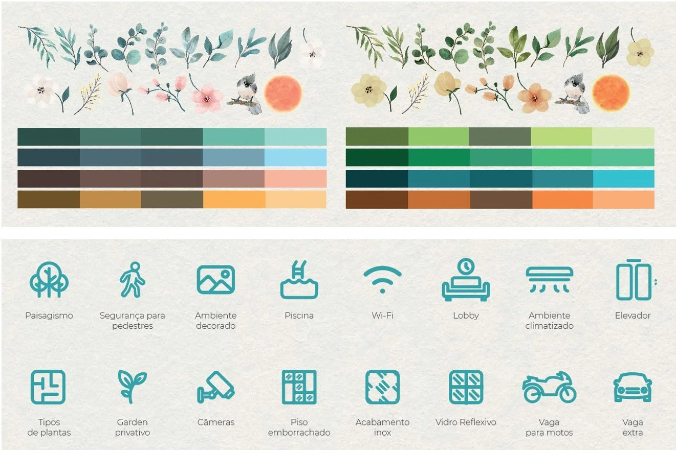
❋ Three Visual DirectionsEach development typology received its own visual language, with distinctive concepts, colour palettes, typography, imagery and graphic elements reflecting its architectural character and target audience.
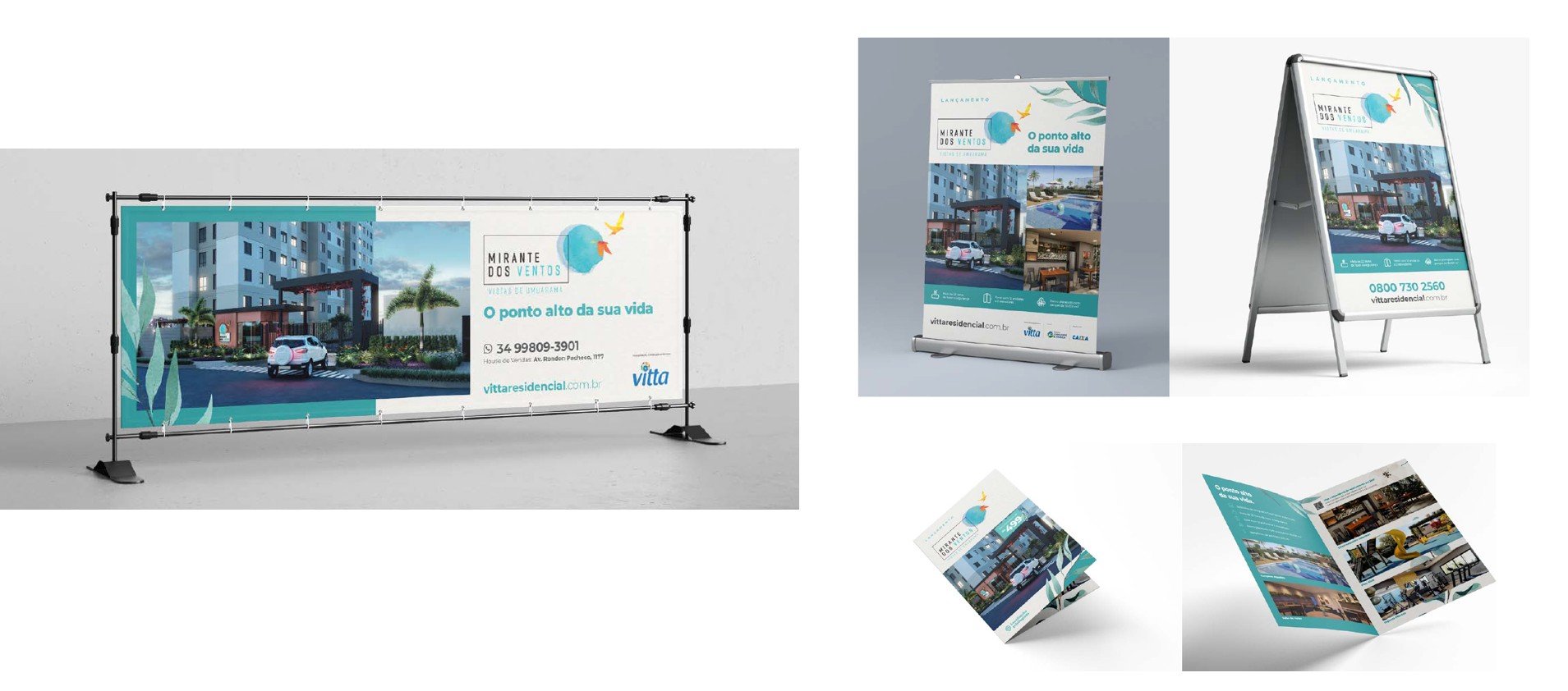
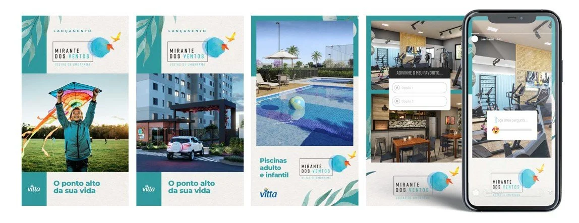
❋ Visual Assets GuidelinesClear standards were established for logos, iconography, photography, colours, layouts and key applications, giving internal teams and external partners a practical framework for implementation.
❋ Consistency at ScaleThe system was designed to streamline creative and approval processes, allowing Vitta to launch developments in different Brazilian cities more efficiently while preserving visual standards and brand excellence.